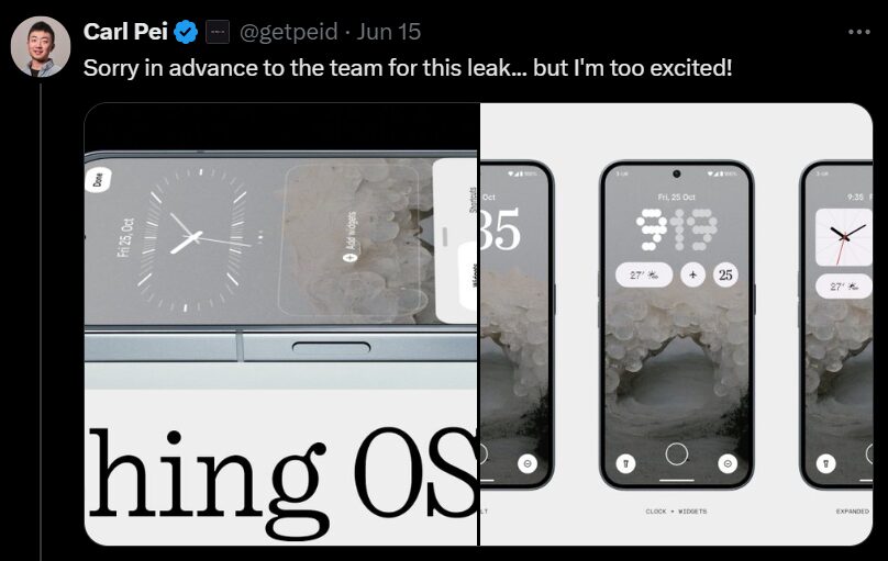
Is Nothing OS 3.0 the future of smartphone software? Get the inside scoop on rumored features, potential release dates, and compatible devices. Unleash the power of Nothing OS 3.0! Our in-depth guide dives into everything you need to know, from confirmed features and compatibility details to separating fact from fiction. Learn how Nothing OS 3.0 can transform your Nothing phone experience and ensure you’re ready to take advantage of all the exciting possibilities coming your way. uncover the latest on Carl Pei’s surprising revelations about the future of Nothing OS 3.0 on x platform at 15th june.
Nothing os 3.0
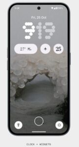
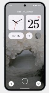
Nothing OS 3.0 is gearing up for a September release, bringing a wave of customization options to your Nothing phone. Nothing OS 3.0 promising a significant refresh for the user experience on your Nothing phone. A key highlight seems to be the revamped lock screen, with leaked information courtesy of CEO Carl Pei himself hinting at three distinct styles. Users can choose between the classic clock and date layout, a more informative option that integrates widgets like weather and contacts, or an expanded widget area for even greater functionality and customization.
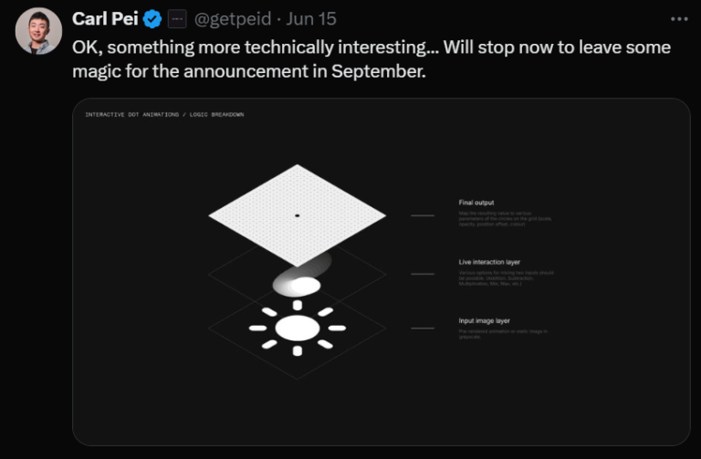
Beyond the lock screen, rumors swirl about interactive dot animations livening up the Quick Settings panel, adding a touch of playful personality. The whispers also extend to potential additions on the app front, with a native gallery app and a dedicated community app possibly gracing Nothing OS 3.0. While specifics about these apps remain under wraps, their inclusion would further enhance the user experience and foster a stronger sense of community among Nothing phone users. Overall, Nothing OS 3.0 shapes up to be an exciting evolution that injects more customization options, playful animations, and potentially useful apps into the Nothing phone experience.

Revamped Lockscreen
Get ready to personalize your phone’s first impression! Nothing OS 3.0 promises a revamped lock screen experience that caters to different user preferences. The classic option maintains the familiar clock, date, and day display. But for those seeking more functionality, the Clock + Widgets style steps it up. Imagine a redesigned clock (potentially featuring a unique dotted font teased by Carl Pei himself) alongside weather updates or a quick glance at your next phone call.
The real customization powerhouse comes with the Expanded Widget Area. This option goes beyond basic information and lets you take control directly from the lock screen. Think playing music without unlocking your phone, toggling Wi-Fi with a tap, or launching your favorite apps instantly – all without needing to bypass the lock screen. Whether you prefer a clean and minimal look or crave easy access to essential functions, Nothing OS 3.0’s revamped lock screen seems to offer a style for everyone.
Interactive Dot Animations:
Imagine a more engaging experience with your phone’s Quick Settings panel. Nothing OS 3.0 rumors hint at interactive dot animations. Tapping on the Wi-Fi icon might trigger playful connecting dots, or the weather icon could morph with live weather updates. These subtle animations could add a touch of whimsy and personality to everyday interactions with your phone.
Native Gallery App:
Currently, Nothing phones rely on third-party gallery apps. Nothing OS 3.0 might introduce a native gallery app, offering tighter integration with the Nothing ecosystem. This could translate to seamless photo sharing with Nothing contacts or even cloud storage solutions directly within the app, making managing and sharing your photos a smoother experience.
Community App:
Details are scarce, but a dedicated community app within Nothing OS 3.0 could foster a stronger connection between Nothing phone users. Imagine a platform for discussions, sharing tips and tricks, or even receiving official updates and announcements directly from Nothing. This app could create a sense of belonging and allow users to get the most out of their Nothing phone experience.

Nothing OS 3.0: A Potential Personalization Powerhouse
Nothing OS has delivered a clean and functional experience for Nothing phone users so far. However, Nothing OS 3.0 seems poised to be a significant upgrade, particularly in terms of customization and user experience. Here’s a breakdown of the potential differences:
Lock Screen Transformation:
Previously, the lock screen offered limited customization, likely just displaying the standard clock, date, and day. Nothing OS 3.0 throws open the doors to personalization with three rumored styles. The classic option maintains the familiar layout for those who prefer simplicity. But for those seeking more, the Clock + Widgets style integrates functionalities like weather updates and contact information alongside a potentially redesigned clock. The real game-changer is the Expanded Widget Area. This option allows extensive customization with space for various widgets and quick actions – imagine controlling music playback, toggling Wi-Fi, or launching apps directly from the lock screen, all without unlocking your phone.
Focus on User Control:
Previous versions of Nothing OS offered a relatively static interface. However, Nothing OS 3.0 appears to be embracing user control. The lock screen revamp is just the beginning. Rumors suggest the ability to choose fonts (as hinted by Carl Pei), potentially offering more control over the overall look and feel of the phone. This shift towards customization aligns with a growing trend in mobile operating systems, empowering users to personalize their experience.
Beyond the Basics (Based on Rumors):
Currently, Nothing phones rely on third-party options for tasks like managing photos. Nothing OS 3.0 might introduce a native gallery app, offering tighter integration with the Nothing ecosystem. Think seamless photo sharing with Nothing contacts or cloud storage solutions built right into the app. Additionally, rumors swirl about a dedicated community app. While details are limited, it could foster a stronger connection between Nothing phone users, potentially becoming a platform for discussions, sharing tips, and receiving official updates directly from Nothing.


Conclusion:
Nothing OS 3.0, slated for a september release, paints a picture of a more user-centric future for Nothing phones. Leaks and rumours suggest a significant overhaul, particularly in the area of customization. The revamped lock screen with multiple styles, potential for interactive animations, and whispers of native apps all points towards a more engaging and personalized experience.
While details are still under wraps, Nothing OS 3.0 seems to be departing from the standard mobile OS experience. With its focus on user control, playful aesthetics, and potential community-building features, it could carve a unique niche in the smartphone market. However, it’s important to remember that these are just speculations. We’ll need to wait for the official release to see how Nothing OS 3.0 truly shapes the Nothing phone experience.
For more updates and feeds about nothing phone and tech updates also for other entertainment feeds. stay tuned by turn on the notification and follow us @sportsweeb.


